
.png)
What is Zingbox IoT Guardian?
Zingbox IoT Guardian is a real-time Internet of Things (IoT) security platform. It continuously monitors and learns real-time behaviors of all IoT devices in a network environment to manage all IoT assets and protect them from attacks and threats.
Currently, Zingbox focuses on healthcare and most of the customers are hospitals and clinics.

IoT Guardian monitors medical IoT devices and other IoT devices
Integration in IoT Guardian
To easily establish the connections between the Guardian and third-party products that users are using every day to manage devices, Zingbox integrates with them in Guardian. As a result of integration, users can synchronize device metadata between Guardian and their asset management information system, scan vulnerability, or complete other tasks that Zingbox doesn't support, like quarantine unhealthy devices and so on.
Explore and configure
Explore products with How-to guides to understand how integrations work and what benefits they bring.
Easy management of integrations
Manage configured integrations in In-use table with a focus on working status.
Why redesign?
The current Guardian was old, outdated and messy. We were working on applying a new visual design system to it. However, it was more than just a redesign on the surface. We needed to think about how to improve the overall user experience by this chance. Thus I took charge of redesigning the integration experience. Here's a look of the old integration pages:


Integration page
Configuration page
Problem
Having a hard time to perceive important information
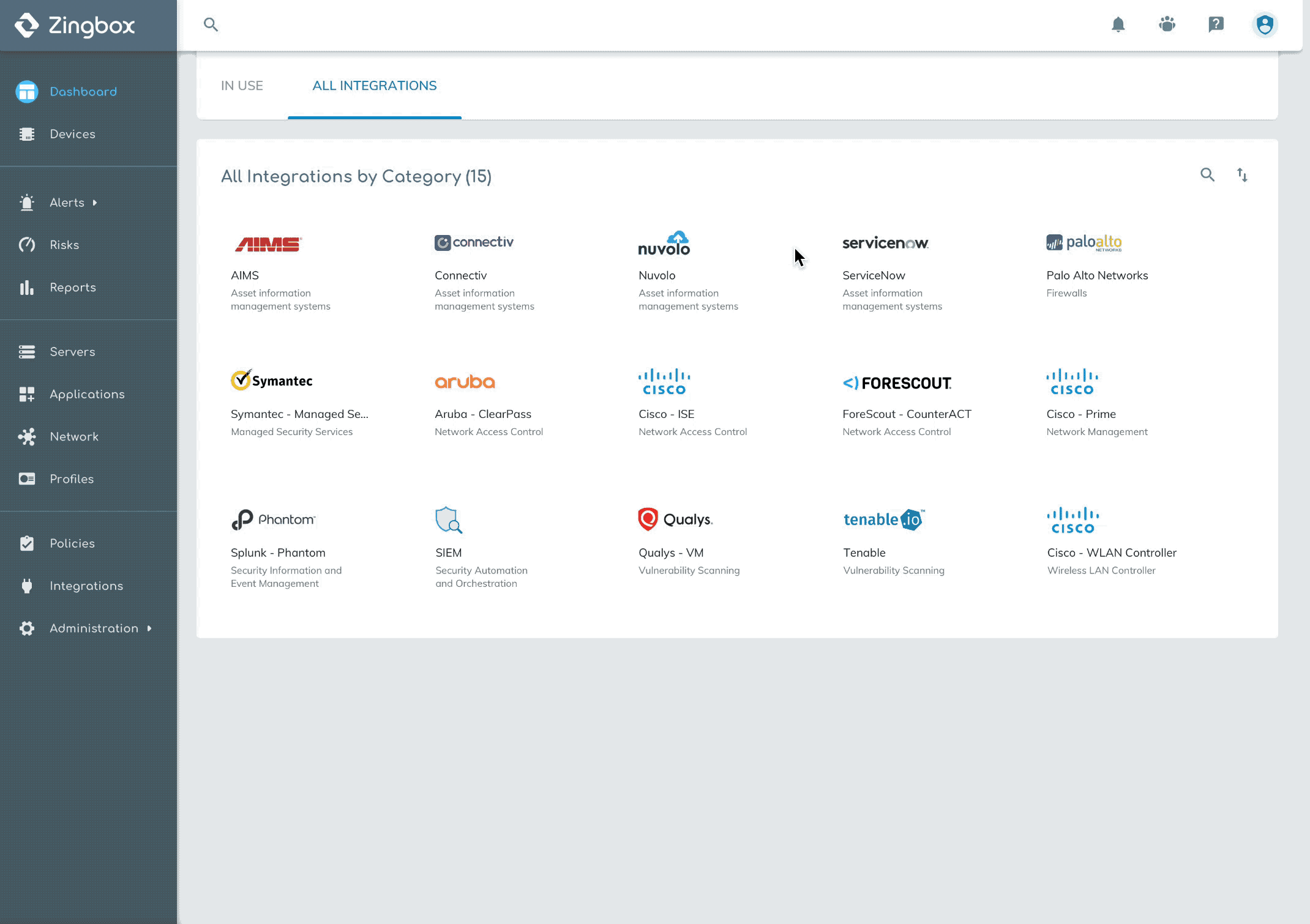
In the current integration page, there were 15 available third-party products classified into 9 categories based on their functionalities. After configuration, integrations might have 3 possible statuses which were connected, disconnected or disabled.
1. Important information missing
2. Confusing status icon

3. Low scalability
Challenge
How might we help users effectively manage integrations?
Brainstorm 1
What is the high priority task on this page?
When users had some products configured, they probably did not care about other products since they might never use them later. However, what they did care about was whether all integrations worked well, was there any disconnection and did they need to investigate anything unusual.
Thus, we should help users focus on configured integrations and know what requires their attention with a quick glance.
Decision: Differentiate configured integrations and not configured ones
Users don't want to be distracted with irrelevant things. The more straight we show information, the faster they perceive it.
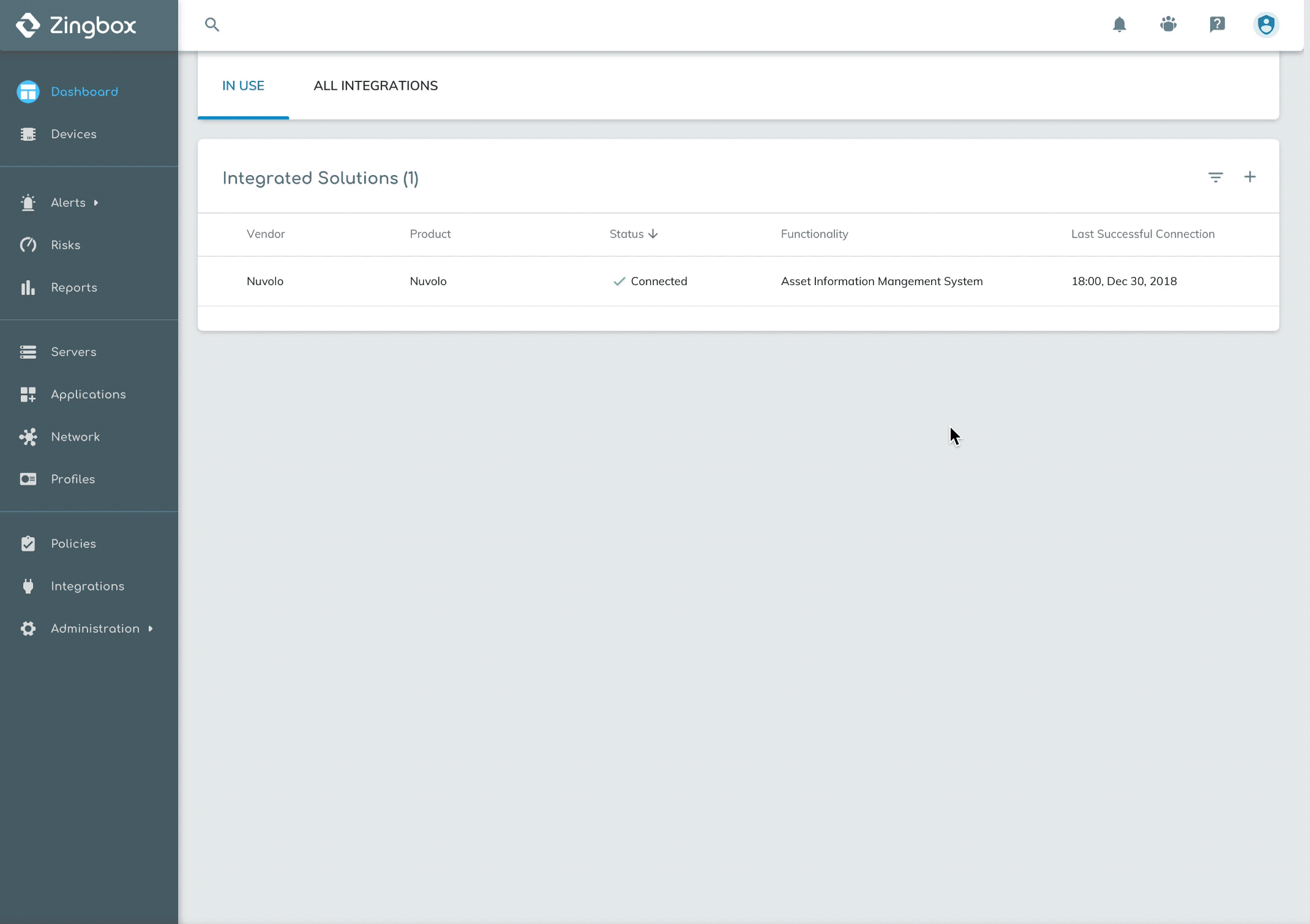
The table lists out all configured integrations with status in a clear structure and the disconnected ones would be always on the top to raise attention.

In-Use Table

Functionality Cards
Grouping is not helpful but increases the scanning time for users to find out disconnected integrations.

Brainstorm 2
What's the best way to help users find third-party products?
The following issue to address is how to improve the experience of finding products users are looking for. I carried out some explorations to hear feedback from the team.
Exploration 1 - Reuse old style

After discussing with the product manager, I realized that from a business point of view, we still need to have an individual space to display all the products we can cooperate with, showing that we are increasing our capability by caring customers' needs and growing to a powerful platform.
So hiding the whole list under the in-use table wasn't helpful to convey this important message to our clients,
Exploration 2 - Introduce 'Tab' into this page
This time, I separated the In-use Table and All Integrations into two tabs. By this way, users were able to have a clear vision on both configured integrations and all available products.

Looking at the current layout, I asked myself: Is this the best way to group integrations? Is this grouping helpful for users to find what they are looking for?
Solution - Break grouping, let users sort and search.
Compared with the terms defined by us for grouping, vendor name or product name should be the first reference the user could recall when thinking about a product. I decided to alphabetically sort products by vendor name. When the list becomes longer later, users still can have a sense of the approximate location of the products or just search them. At the same time, users are also able to sort by categories.

Dive Deeper
"What benefits can I get after integrations? How to use them?"
Need to be supported
Currently, this integration feature served users well to configure an integration. But, the experience before and after configuring was really limited.
Although many users had some knowledge of their familiar products, what this collaboration may bring to them and how to use the integration in our platform were new to them. Right now this job was done by our product managers who communicated that information with customers.
However, this made the whole user experience incompleted and unfriendly. Users would get lost on a page when facing lots of unknown things. They should be supported with helpful information.
Start with understanding how we integrate
I first looked through the integration manuals of all third-party products, seeking opportunities to abstract complicated working principles and transfer to simplified words.
I notice that there were two different types of work modes. One was that users initiated data transmission between Guardian and other product by clicking somewhere hidden in Guardian. In the other work mode, data transmitted automatically once the integration was configured.
Based on this finding, I gave out designs solutions for each type.
Option 1

Screenshots
The background of a screenshot is too noisy and busy, which is not helpful for users to focus on the important spot.

Abstract Illustrations
The emphasized spot is much easier to draw users attention without noise.
Also, it's reusable for all integrations in the same category.
Option 2
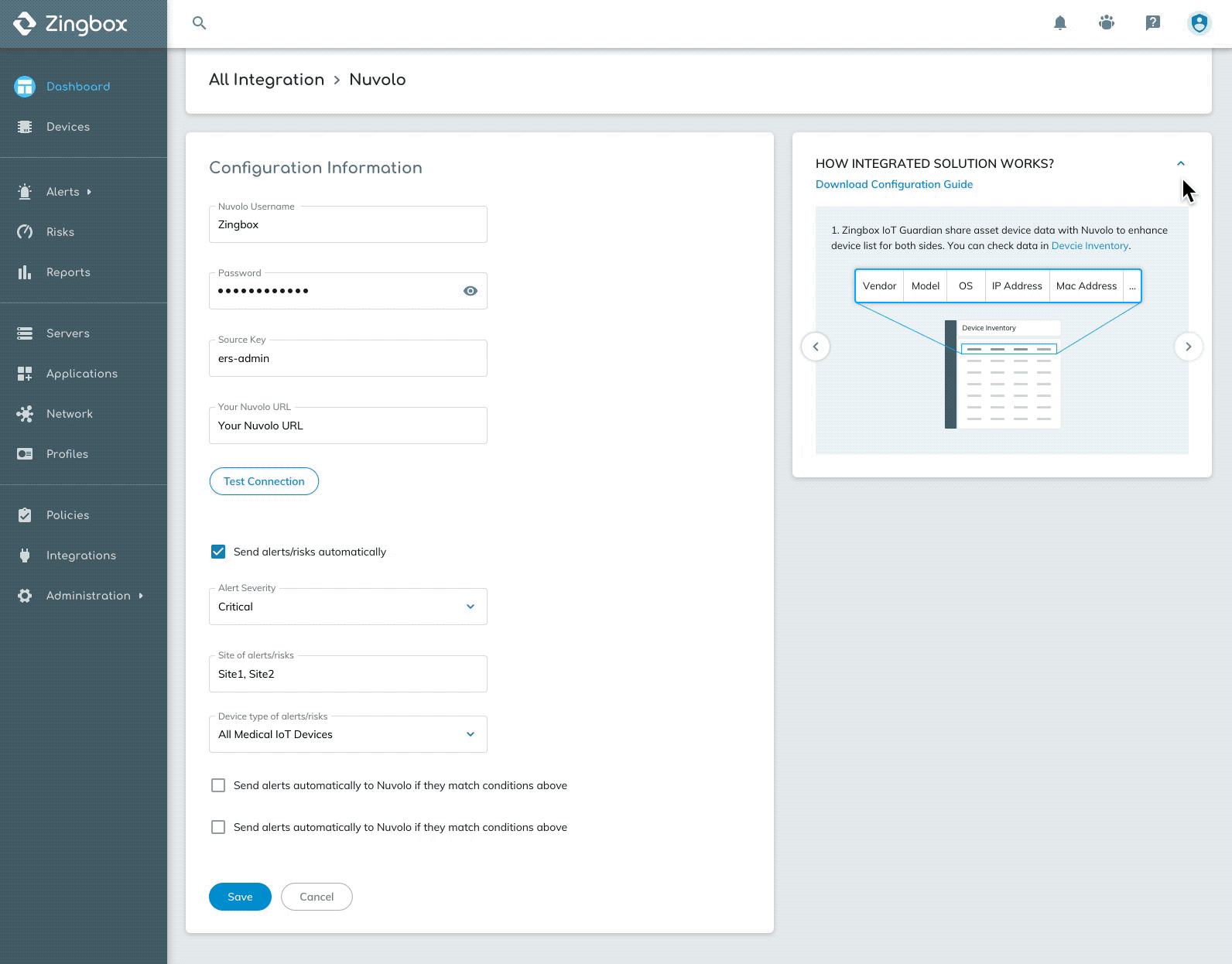
These integrations worked simply, Guardian automatically sent data to third-party products after configuration. So I used the logos of Zingbox and other products with an arrow indicating the direction of data transformation to explain how the integration worked.

Drive user engagement

Tooltip when exploring
Facing all third-party products our platform a brief introduction can help users have a basic understanding of a product and then decide whether to configured or not.
Stable viewing during and after configuration
Tooltip was just an instant view of assistant messages. We should provide users to take a closer look at how to use integrations in a stable place and then take further actions. So I carried out experiments on how to display the tips and created prototypes to help me evaluate interactions.

Version 2
Version 1
Why I didn't choose this one?
Although this version takes good advantage of space where all tips can be displayed at one time, however, the form length of form and tip widget can be different, users need to scroll differently to control 2 widgets
Version 3
Version 4
Why I didn't choose this one?
Information is not straightforward showed, instead, it's too hidden. Also, it will cause interruption when users are filling the form
Why I didn't choose this one?
It hides information behind the target and too far away from users' focus.
Why I chose this one?
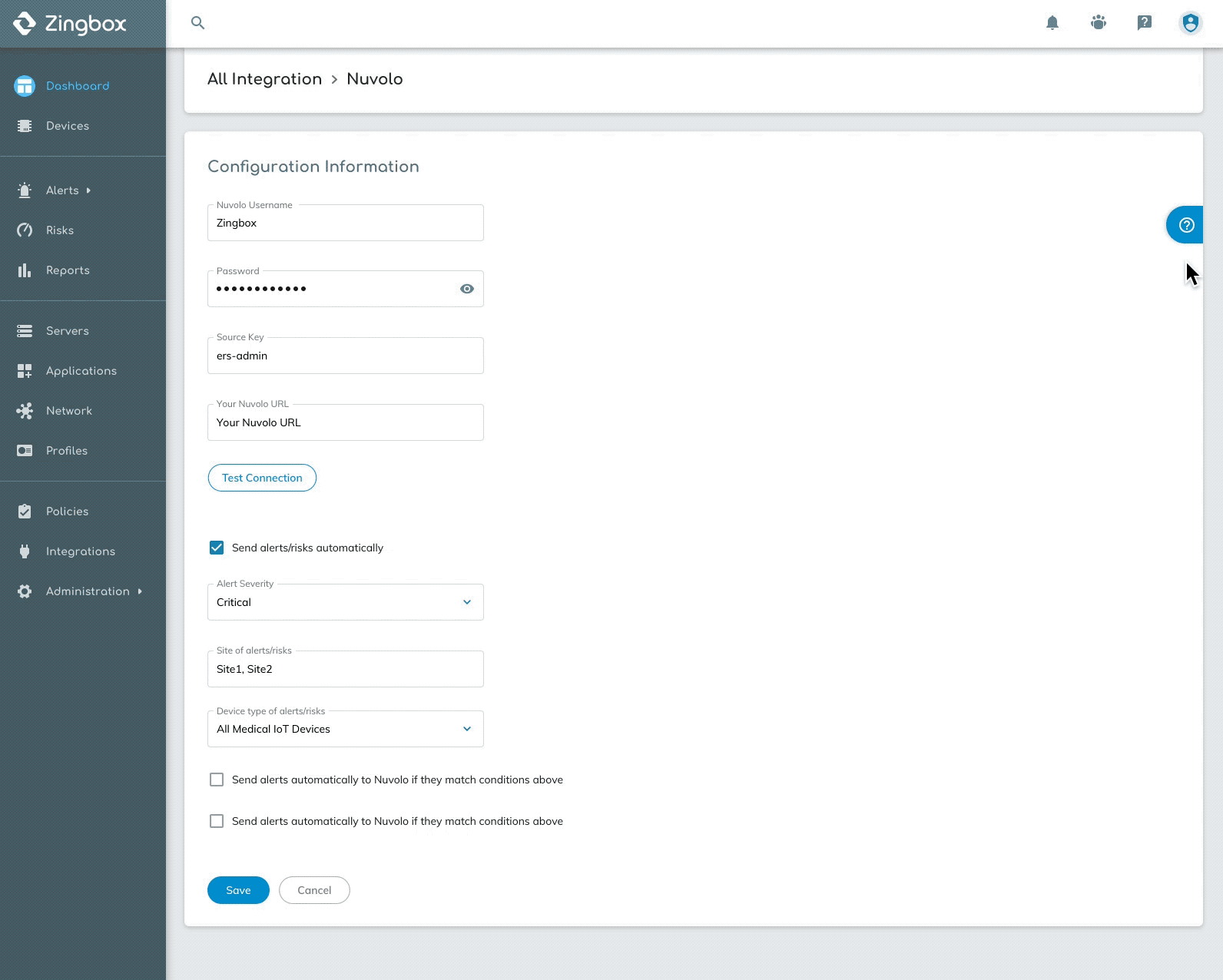
The sidebar shows tips without disturbing users even when they are filling the form. If the assistance is no longer needed, users can also collapse the window.
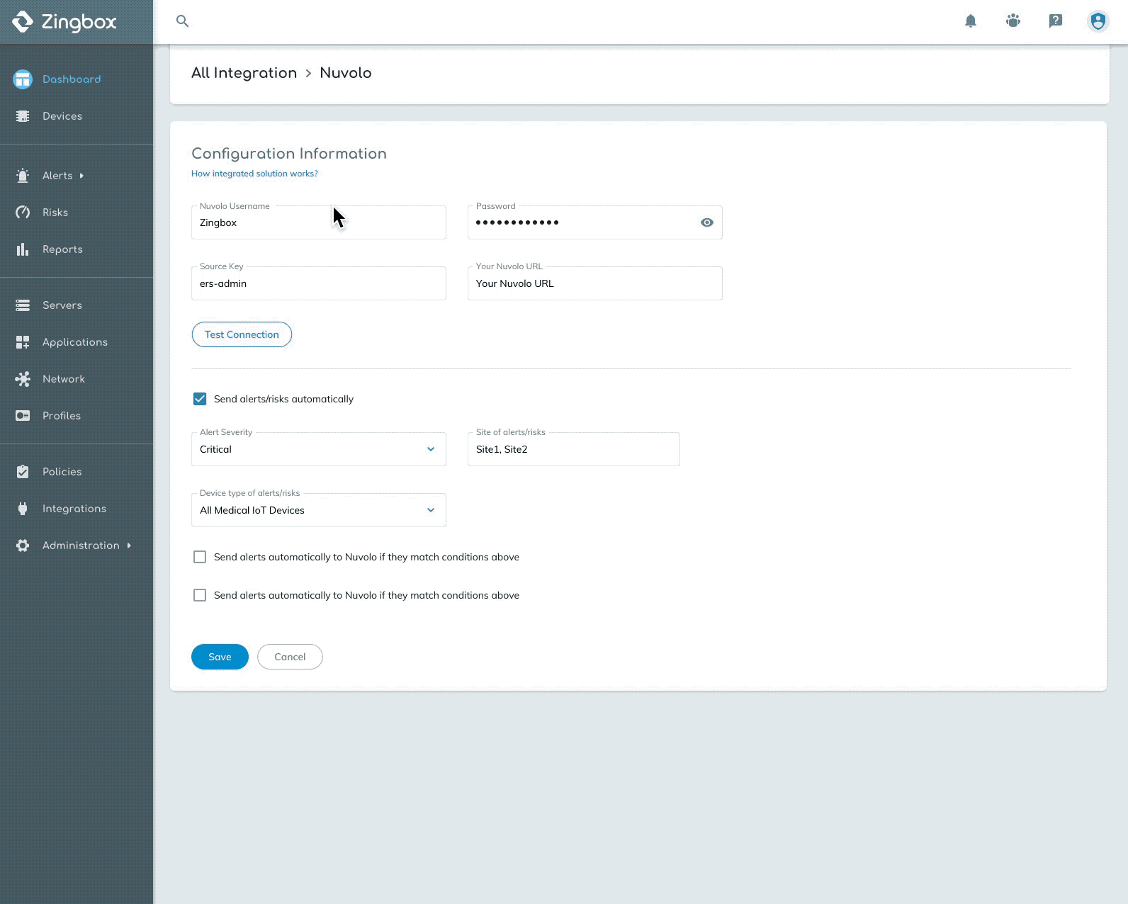
Final Design
In-Use Table

Add from Table

Browse All Integrations

Fill out configuration form
